
Natalie, of course I understand - I LOVE pink! The key is to use accents of your favorite color so that the room as an nice air of purple but it doesn't seem overwhelming. A good starting point is to choose another color to mix with purple. Using more than one color that compliments your favorite will keep one color from overwhelming your decor. For my wedding I wanted to use pink (because pink is awesome) and Anthony wanted to use orange (Go Syracuse) and now it's a hot color combination! What trend setters we are ;)
To help you see color combinations I'd started adding to my flickr a wedding-planning image bank. (Please bear with me - this sorting and uploading is taking longer than I thought it would!)
If you see images you like there, in a google image search, or in magazines, you can start pulling them together to make inspiration boards (see my last post).
This is how my colors came together:

Invitations: (these set the tone for your wedding) Mine were orange on the outside with a pink bow. They folded open to reveal pink inside and the invitation was printed on white paper with pink and orange lettering. There was a pocket for more hotel & reception information below in the pocket.
Cake: We chose a simple white cake with a white lace pattern of frosting. Then we had the florist add the same petals and roses that we were using in the rest of the decorations. This way we knew our cake would match perfectly and we saved some money on the fondant decorations. Don't get me wrong, if you can afford a beautiful "ace of cakes" style cake go for it - I just decided to simplify here.

Ladies: My wonderful bridesmaids wore dresses that were made of an iridescent fabric. They were mostly orange but as the light caught the dresses it had accents of hot pink. Their bouquets were pink and orange roses. My dress was not quite ivory, not quite blush pink. But a good color for a pale girl like myself! I carried different shades of pink roses and my bouquet was wrapped in extra fabric trimmed from my dress when it was altered.
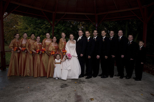
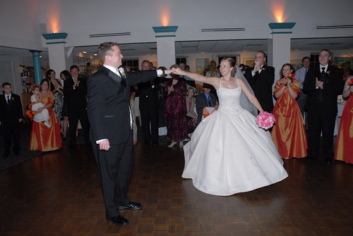
Gentlemen: The groomsmen wore back suits with ivory shirts. The only color was in their boutonnieres - they had pink and orange small roses. Anthony wore a black tux with ivory shirt, vest and tie so he stood out. He also had a pale pink rose.
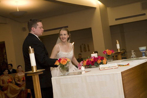
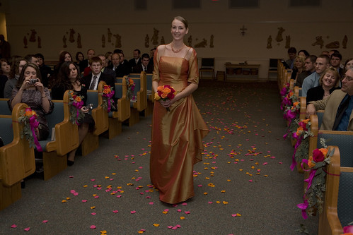
Ceremony: In the church we had simple vases of pink and orange roses (same as the bridesmaids bouquets) and a wreath of roses around our grandparent's remembrance candle. We also did small groupings of roses and ribbon on the ends of the aisles. The only other color was the pink and orange (fake) rose petals that lined the aisle. The church doors had wreaths on the outside and we moved these, along with the flowers on the pews to use again at the reception.
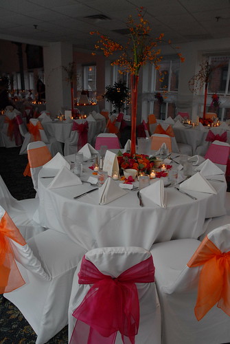
Reception: Let's see... we re-used the pew decorations and put them between each of the large windows. We also used the wreaths on the doors of the ladies room stalls. (I thought the bathroom was a bit sub-par and this helped a lot) We chose all white linens (table cloths, napkins, & chair covers). The chairs had alternating pink and orange sashes. The centerpieces were wreaths of pink and orange roses with Eiffel tower style vases filled with orange colored water and bittersweet in the centers. But what I think really made the ambiance in the room was the lighting my awesome DJ, Erich Kruger, helped me add! (see the cake photo above to see the effect). We had lights with pink and orange gels aimed at the ceiling so that the room would literally glow pink and orange. It looked GREAT in person, but unfortunately with some of the photos with flash (like below) the effect is lost. As a photographer I know lighting is VERY important - talk to your reception hall coordinator and ask to see the room at the time of day of your event and with the lights dimmed to their usual wedding levels!
A note on color & reception and ceremony locations. It is best to choose colors that will work well with the decor that is already in the room: Painted walls, carpets, chairs if you're not covering them, ect. Both my church and hall had a bluish teal, but luckily that looked out with pink and orange. If your chosen colors clash with decor at your facilities you may want to consider choosing another accent color of covering some of the existing color at the hall.
1 comment:
Thanks for the advice Katie! =)
Post a Comment