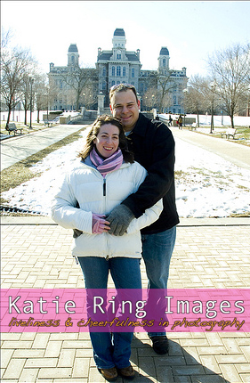
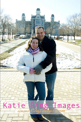
#1

#4

After more comments I have removed choices 2 & 3. I took away 2 because no one really liked it, and 3 is gone because while it was popular I know it's going to get cropped out and re-posted. (# is the look that's shown in my previous post). I am thrilled when my clients share my work with friends and family but I want my name to stay attached for web use as a form of advertising! For those worried about distracting from the image, don't worry the photographs on my own website will remain logo-free. This is just for images used on social networking sites.
Thanks to everyone who has voted so far!

13 comments:
I vote for either #1 or #3 (leaning more toward the former). It's pretty sweet!
I like #3 or #4.
i really like #4! Also, i like number 1 in this shot, but i don't know if the pink would work for all shots. i would be worried that it would look off, or be distracting. So, i vote for #4. btw, love that you are using our photos for this :o)
i like #4, your name is there, but it's not over-powering
hey, it's jayme's little sister :) he shot me your blog saying you were taking a poll.
my input:
definitely #3. the others look nice and all, but for that specific photo. if it's how you're going to "watermark" your work, that style will only work for very specific poses and you may be dramatically cutting pieces of the image off. #3 has all your information there and doesn't cover anything in any shot. even clear watermarks can be dangerous like that.. the sneaky bastards.
just my 2 cents :)
#2 or #4 I'd say. I like that it's bold. And you're right about girls doing the shopping for photographers so pink doesn't matter really!
I'm gonna re-vote for #4. Seeing them again I think your name stands out more in #4.
Hey Katie, I am going to go with #4, I like that it's more of a "watermark" effect then the option above it. Its there, but its not screaming. Lovely pic's! Congrats Abby!
4. Definitely. Unless mostly females make all the recs and decisions about wedding photos/are your clientele, in which case you should disregard my opinion
#4, less is more
I go with #4
Yup, I am voting for #4 again, cause i want to mention that it is easier to read - And thanks Andrea :o)
Post a Comment